Why You Need A Brand, Not Just A Name
The graphic representation of your name is pretty dull, Sans Serif is in vogue at the moment, so I’m going to use that for the poster for my next gig, I’ll tell the promoter they can choose the artwork and I’ll just turn up and play. That way of thinking will do you no favours...
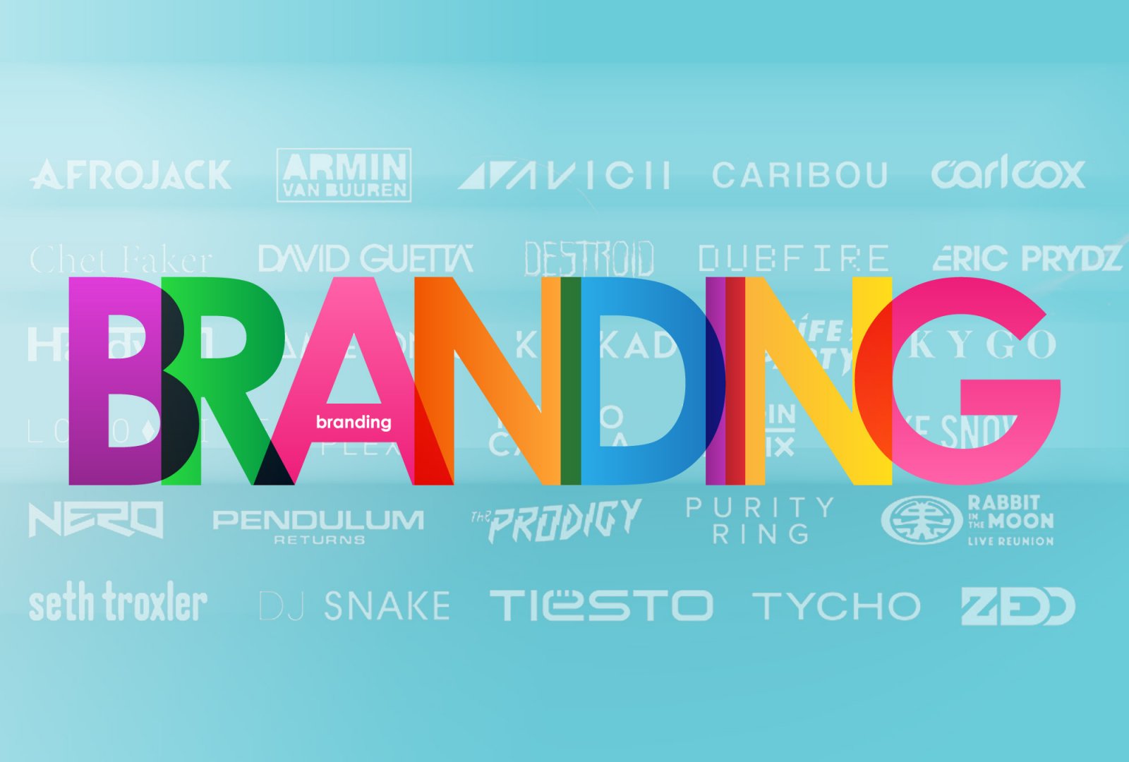
There’s a lot to a name, there is even more to the font, typeface and/or logo that name may be printed in. You may have varying levels of control or influence with how your live promotions are marketed, but when it comes to branding your work for distribution, and you are working with indy level resources, best to put on your thinking cap and give your name and logo some more consideration. Here’s a few artists that really have their branding game on point and we all can learn something from.

In Silicon Valley there is a couple of aspects to the name game that you probably know, but didn’t realise you knew. A company's name will often contain an ‘x’ or ‘z’, maligned constants that tend to stick out. Netflix, Amazon, SpaceX.
But if you really want to be guaranteed success, include a repeating letter. Twitter, Apple, Reddit, and bonus points for a double ‘o’ ...Facebook, Google, Yahoo. The double letter phenomenon is difficult to explain. Coincidence and parallel thinking is very likely to have played a part, but it was also a touch of subconscious emulation going on too.
‘Skrillex’ was Sunny Moore’s online pseudonym that he adopted as a solo artist when he left the emo world behind. Sunny didn’t realise that he was assuming the branding technique that Zuk and others trailblazed for him, he just chose wisely on accident. So wisely in fact that the double reating ‘l’ coupled with the ‘i’ forms a minimalist variant that you see him use more often than the full kit.

As the story goes, he kept on having people refer to him as ‘Mario’ (in falsetto). That’s pretty annoying. So what’s the solution? MaRLo needed to contest these mispronunciations with a pretty ingenious branding strategy. He needed to ensure that the pesky letter in question was definitely not an ‘i’ but an ‘l’, or more correctly, an ‘L’. But leaving the ‘All Caps’ on doesn’t really convey what you need it to in every corner of the globe or with every publicist, blogger, broadcaster because they are just going to rewrite their copy the way they feel like.
Necessity is the mother of invention and the capitalisation of some letters and not others not only tempers the misreading of your name, it creates its own branding. Branding that is not restricted to logo art, but can be a signature inked with most typefaces, across any screen or page. The Name as Brand, or Brand as Name is fully appreciated when you see MaRLo listed on an event poster. The promoter is compelled to adapt to his visual style guide even if they don’t use any other artist’s copyrighted logos. Everyone else on the lineup is listed in a consistent name script, ‘Titled Heading’ or ‘ALL CAPS’ but not MaRLo, his name pops off the poster because it looks like it’s done in error, when it was all part of the plan in the first place.

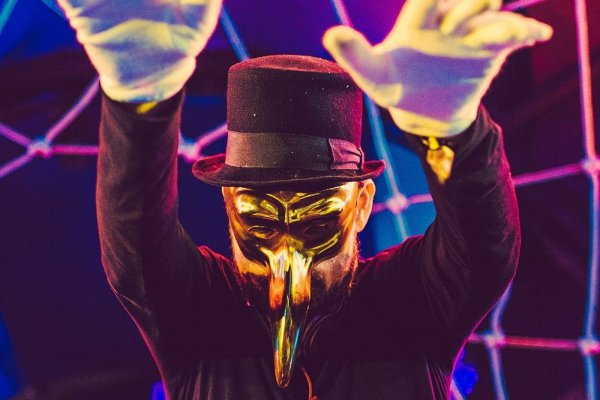
To create a emblem from a name is one thing, to manufacture a symbol that works on multiple levels is quite another. Designers will bore you to tears about form and function until tomorrow if you care to listen. Zhu’s branding is exceptional and far and away the best in dance music IMO.
Take the US flag, a universally recognisable form. Top-left quarter is considerably different to the remaining 3 quarters. Then incorporate your name into the logo. The ‘z’ is pronounced, but ‘h’ and ‘u’ are there, squint and you’ll find them. Finally, ensure that it is reduced to minimalist form, in this case 3-5 brushstrokes. Make it work on the screen, on merch, on posters or just about anywhere. Make it so integral to your enterprise that your personal identity is near secret, and your stage show centers around this huge luminous light box beaming your name out to the audience for however long your set goes. That’s why it works, it’s familiar, yet foreign. It’s bold, yet unassuming. Its simple, yet effective, and that’s really the best compliment you can give any brand.
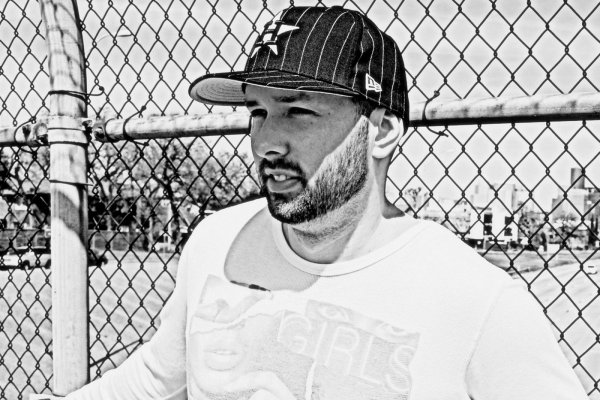
Cam Weller has worked with artist on tours and festivals for more than 5 years, mainly in the dance and electronic music world. He has a communications degree from RMIT and produces content for organisations across various media.
@camweller